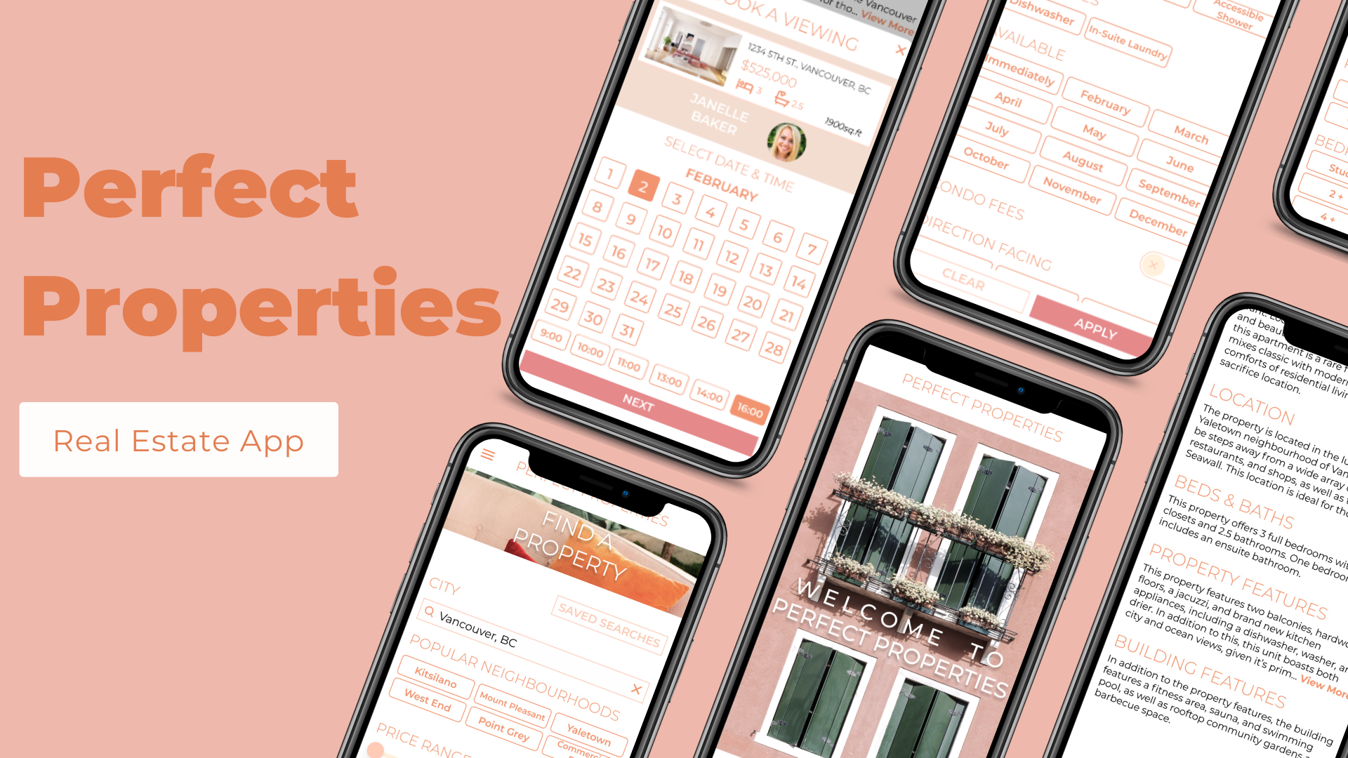
Focusing on User Interface Design:
Perfect Properties Real Estate App for CareerFoundry UI Specialization Course
Project Background
I completed this project as my capstone project for Career Foundry’s UI for UX Design Specialization course. The objective of this project was to create "a responsive web app that provides property buyers with information on properties of interest." Specifically, this product seeks to provide unseasoned, typically younger home buyers with a user-friendly experience that provides them with easy access to the information they need to make the best choice possible. This product aims to give the user the abilities to easily search, compare, and save properties they like, and to contact the relevant realtor with questions, as well as to schedule viewings.
Please note that this project purposefully did not require UX research to be done, and focused on UI skills.
Ideation & Iteration
To start, I made sure to create user stories and map out some of the primary features I wanted to include in this product. They included:
The ability to access as much written and visual information as possible about properties the user is interested in, in order to make an informed decision.
The ability to easily assess if a property matches the user's criteria and compare it to other properties.
The ability to mark properties the user likes in order to easily revisit them.
The ability to contact the right person in order to schedule a viewing.
The ability to search and filter properties in order to find the right matches for the user's needs.
Once the main functions, features, and needs were determined and planned, I created various levels of wireframes to begin building my design from. These designs increased in detail as I made more decisions regarding layout and design. The designs were developed using Figma, originally using a 12-column grid, which was later changed to a 6-column grid with a 10px margin.
UI Inspiration & Style Guide
Prior to selecting colours, fonts, and shapes, I created two distinct moodboards that I hoped would convey the feeling and mood I wanted this product to evoke. In general, I wanted the app to have a modern but earthy appearance with a calming but fun feel.
"Moodboard 1" (left) had an overall light theme with a clean, crisp, and airy atmosphere. It would include a lot of whitespace and incorporate lighter, brighter shades, with whimsical but relaxing colours. I wanted to include the look or feel of natural elements like wood, and try to create a feeling of calmness and serenity.
"Moodboard 2" (right) had a darker, more minimalist feel. I drew inspiration from darker elements with natural ones like darker wood and trees, as well as man-made features like metal and brick. I liked the idea of using darker, calmer tones with a bright green for a fun feel. This moodboard would have a more introspective, intense, but simple mood.
Finally, I decided to go with "Moodboard 1" (left) because of its light, simple, and minimalist appearance. I felt it would give me the opportunity to be playful with colour without taking away from the listing images, and that lighter, brighter colours would make guiding my user through the app a bit easier. In addition, this moodboard felt more pleasant and fun, while still allowing for simplicity and modernity in a less intense way. The project brief asked for "quick, clean, smart", and I felt this was a better fit for this description.
The palette I chose was inspired by "Moodboard 1", but quite different from it, although I still feel it incorporates all the characteristics mentioned above. I chose to stick with a somewhat monochromatic palette and use a lot of whitespace, and to use imagery very selectively so as not to take away from the listing images (ie. I only used images for main page headings like "Viewings", "Find A Property", etc.). The images I used made use of the colours on my main palette, but for the most part also included green, a colour I found difficult to incorporate in other elements.
Right: Style Guide preview. See full Style Guide here.
This application was designed for three different breakpoints (mobile, tablet, and desktop) to ensure that the design was able to carry all of the elements mentioned above - the look and feel, plus all the proper content - across various devices.
The final product is what you see below! Perfect Properties gives the target audience all the functionality they need, while delivering it via a pleasant, eye-catching design. Not only will this app allow users to search for, save, and compare viewings, speak to the property's realtor, and set up viewings, but it will do so in an environment that they will gravitate towards for its clean and beautiful design.


